Monday, September 30, 2013

Blog 5 Karla Salazar

Karla Salazar

I have purchase the muslin that I will use to make the pattern of my dress. I also bought the fabric that I will be using for the actual dress, the fabric is white in color and it has a little stretch in it as it was something that was discussed in class during my board presentation. I also bought the zipper that I will add to the dress.


In the above pictures I started working on one of my props, I will be using a glass bottle from a drink I had and make a painting on it. I will also use the bottle as a vase of flowers that I will use to show the theme of my dress. I started taking all the stickers and names off the bottle, and cleaning any glue left behind, I did this so that I can start painting on it.


In the above pictures I started playing with the napkins to see if I could create flowers. I want to use flowers in my dress, this way it will not be so heavy or sticky will so much glue. The flower on the bottom was the first one I tried but it did not come out so good. The flower on the top came out better because I used more pieces of napkins to create more ruffles. I will be using the flower on the top for the dress.

Ari Naranchimeg: Blog Post #5

     For my final project I’m using a twisted white rope and a disposable spoons.
I’m starting with a rope, since this is the most difficult stage of my dress.


 First I have tried to comb 40 inches long rope. What I am doing is I untwist the rope into three pieces, and then untwist the three pieces into even smaller pieces. Now I comb those smaller pieces to spread them and make them fluffy. But this long piece did not work as I planned. It got tangled.


Since the long one did not work as I planned, now I cut out a rope into 18inches long pieces, and then repeat the same process. According to my estimation I need about 100 pieces. I also tried several types of combs, and paddle brush is working the best so far. Wish me luck!! ;)


Blog Post 5: Karla V


To start off, I purchased some 'muslin' like material. I also go thread to match with it. I got about 3 yards, I figured that should be enough. My next step is to cut it out and start putting it together.


I've been collecting cardboard boxes through my mom and my sister. I started taking them apart to create that texture and look on the first picture. I have about 3 or 4 different patterns in mind. I also have a BUNCH of cardboard boxes already. I still need to find some of my props and start painting them.


Blog Post 4: Karla V

For blog post number 4 I chose to style my sister for a concert in UCF. I coordinated this outfit by adding a tight red dress with some black sheer. It's a spandex type of material. A gold necklace and black heals add the perfect color combination matching with the dress. The watch is also golden with black. We call this style 'Lady in Red.'

Blog Post 5 -JaDiona Davis

 For my display, I want to incorporate an atmosphere that involves cleaning. Because I am attempting to make strip mop dress I want to have a display that portrays a gathering of cleaning supplies or either a room that needs to be cleaned.
I may use some extra muslin fabric that I have lying around to incorporate some dirty looking rags or laundry.


Blog Post 4 - JaDiona Davis

For my post I chose to dress my best friend. He prefers to be comfortable when he decides to go out anywhere so with that in mind, I chose to put him in a light brown linen shirt with a white cotton shirt under. Normally the brown shirt is buttoned to the top but because he wanted to me more dressed down that day, I left it open. I paired the shirt with a nice pair of light denim jeans with brown threading to make the shirt stand out. I also decided to a pair of casual loafers that had different shades of brown together. Added a few accessories and created an outfit that he could wear out various places, whether it be going out with his family on a picnic or buttoning up his linen shirt and going out on a date or to the movies.

Tuesday, September 24, 2013

Vanessa Blog Post #4

This is my 6 year old son Xavier. Since I am interested in fashion I have noticed that he also has fashion sense at an early age. I enjoy dressing him daily because he is not really into "play clothes" like most kids his age. I was able to coordinate this outfit that is inspired by the first week of fall. Here Xavier has on layers to protect him from the weather. A button up woven and slim fit denim is common attire for Xavier. Because of the earthtones in his outfit I complimented the outfit with brown leather chuck taylors. I finished his look with a neutral colored bubble vest and gave him some shades so he can turn up his swagger for the picture. My son Xavier is always trying to give me styling tips as he definitely a fashion leader in his first grade class.

Blog Post #4: Ari Naranchimeg


      I have chosen casual clothing that fits for both work and hanging out with friends after work. Top is made out of 100% polyester, which is light and comfortable. It is also sleeveless and fit for summer weather. The jacquard skirt is made out of 100% cotton, which keeps its shape well. These two outfits go well together because the top is loose fit but the skirt is tight fit, which shows off the body figure. I have chosen a mid-tone color for the top according to the skirt colors.
Karla Salazar
Blog 4

      For this assignment I had the help of my daughter Emily, she is 6 years old and therefore I got a chance to play with her style. I decided to keep it playful and fun with a little color. The shirt is made from 60% Polyester and 40% cotton, it has lines of different colors going across with the words sweet written on the top. The shirt also has a cupcake in which the top is made from sparkle material. The pants are brown in color, even though it is not visible in the picture, and they are shorter in the bottom and folded about an inch at the bottom also, they are 50% Polyester and 50% cotton, with elastic at the waist. Her sandals are also brown with stones of different color to accessorize, and the whole look is put together with a Hello Kitty hat that has pink stripes and Hello Kitty faces on it. This is a very fun and cute summer look, perfect for a little girl.

Monday, September 23, 2013

blog #4  Catherine Miranda
                                               " Style me What you Talking about"
So we had this assignment of  "Style a friend and take a photo" and lucky for me i found a sucker, just kidding i found a open minded girl who said "sure , why not" .
meet Belinda she's 20 years old and love hip hop (well Latin hip hop) ,going to school to be a hair dresser and she been living on the main land for a little over the year ( she is from San Juan PR.)Belinda loves to show the curves she really wants to have..  


                                                                                      Number 1
        so i went into her closet and went on a mission to Style her up.
  In Belinda's happy place that she called her closet was a feeling that she didn't have much use of color (black and blue is her color favorites )which is amazing when you want to be a hair stylist,  how ever i know Black is a color that doesn't ever go out of style but sometime it needs a little help so in this first pix took her jeans that she said she bought on sale at MagRag and that she bought two of them ...can you believe it!! The rip jeans was 76% Cotton, 22% Polyester and 2% Spandex and The "v" neck tee was 100% Cotton with a cotton under garment . I mixed this up with a brown Artificial leather belt and a red beaded and plastic necklace , gold plated bracelets with small hoop earrings. i style her hair in a basic ponytail  with a hat ,I dressed her feet with 6" heels with black spikes,this is fun for a night at House of Blues on Sunday nights
                                                                    For the 2nd look
I now dressed Belinda in a tropical summer spaghetti stapes dress made 100% Polyester (can you Believe she had this treasure all the way in the back of her closet) and dressed it up with a red spandex belt and a multi colored long sead beaded necklaces made of glass with a gold roman style flat sandles that tie around the ankle . This tropical treasure will be good for a nice shopping and lunch with the girls a "Sex and the City" feel .
                                                                  In this 3rd look
Like i said Belinda said that the  rip jeans was her most favorite,So i matched it up with this 100% Polyester
off the shoulder top that had an oriental feel to it .
So to keep the style going with the oriental feel i added this white glass and big beaded necklaces and did a messy ponytail . I dressed her feet in brown striped wedges. This Oriental fortune cookie wold be good for a night out to the movies and a dinner .
                                                                     In this 4th look

I dressed Belinda in this black dress (i couldn't really say the percentage of the dress because she torn off the tag but what i notice with all her clothing i am pretty sure Polyester,Cotton and Spandex has some threads in it *wink wink) I had style this 90's Robert Plamer -Simply Irresistible inspired off the shoulder dress with lots of silver and rhinestones with a silver mesh evening bag with blue suede 6" hells."Trophy!!!"
            In this 5th look
I found this Pink "take a picture it would last longer" dress next to the tropical summer spaghetti stapes dress.Its 60%Cotton and 40% Polyester.To try to make this dress into a office look i styled it with brown leather flat sandles , brown belt and wooded beaded necklaces  .Can you say your hired .

Well i hope this inspired you to raid your closet....you never know what hidden style treasure you might had over looked.


Marci S. Blog 4

I was inspired by a few things; Breaking Bad the t.v show and old western movies where I always secretly hope the bandits will prosper. Due to a recent emotional loss I chose to wear all black in respects to what him and I once had, hence the reason why taking this shot in the rain was perfect. Although fall is upon us, Orlando hardly gets "fall" weather , my dress is long however still extremely light in fabric.  I tied the black hat and long Gypsy dress together with a scarf keeping it cohesive.

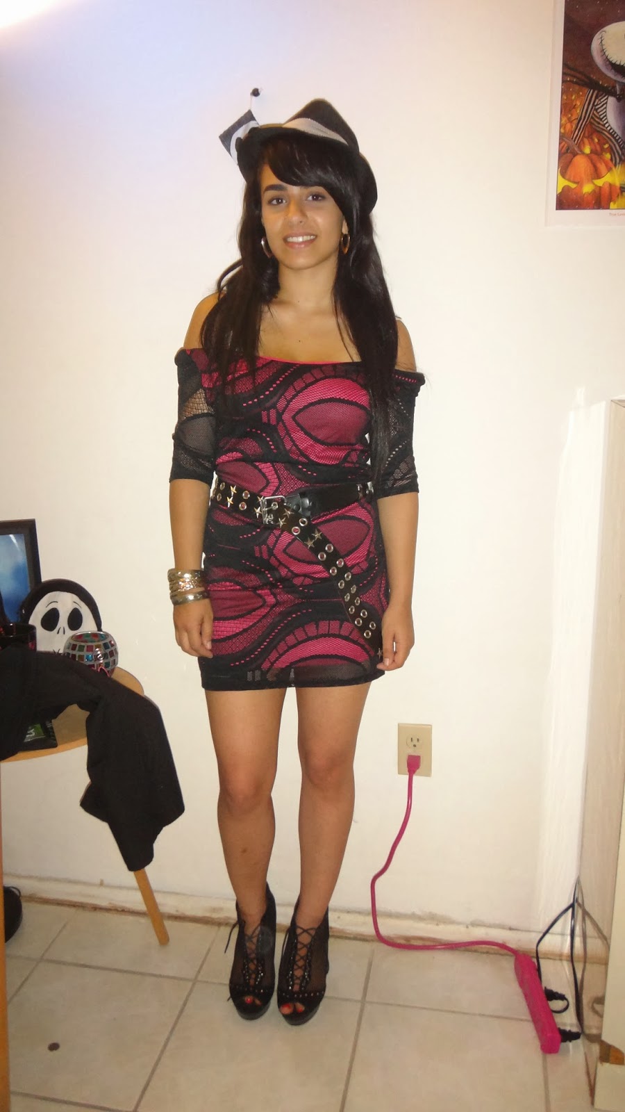
 the dress is a day dress that can be made a night dress with a change of accessories. THE WEEKND IS COMING into concert on Friday and ill be wearing this exact outfit!

Tuesday, September 17, 2013

Blog Post 3: Karla V

I didn't get a chance to visit the mall so I googled an image from a Forever 21 window display.


Unity & Harmony- The combination of colors and them hanging from rings.

Balance- I feel that the boxes add some sort of balance to the display.

Repetition- The boxes at the bottom, the rings, and the colors.

Rhythm- Hanging from the rings adds a sense of visual movement.

Emphasis & Contrast- The lighting and the color combination emphasizes the clothing.

Surprise- Hanging by the rings with the neon thread defiantly adds surprise to the display.
 

Blog Post #3 Lisa R


     In the middle of the hustle and bustle of Disney's Downtown tourist area I found Blink by Wet Seal.  Amid the tourist throngs, I found blink to have a sense of balance, unity, harmony and repetition in the way they displayed their merchandise.  The pants were located in the center and off to either side of the small store.  Filling in the gaps where the dresses, skirts and shirts.  Though the store was small, it was organized which gave any shopper a sense of space.  Wet seal emphasis on the young girl.  The location where the store was located was across from where the live entertainment jam it up.  Good location.  There was an element of surprise that I liked and it was visible from out side, which was the upside down jean wearing mannequin legs.  It immediately caught my eye just from walking by in the middle of the crowd that surrounded me.  It was so impacting that it became the topic of my blog.   White walls and bright colors and lights brought contrast to this store.  Overall I think its catchy and In a good location for business.


Blog 3 - Marci.S

 Forever21 window displays show a lot of the key elements in visuals.
the harmony in the window display shows 3 girls as if they were posing for a photo shoot. One mannequin is slouched in a super model pose. The others have there back in a posh position showing unity and rhythm.
 I also believe the element of repetition is being used with the mannequins as well as the back drop photo behind them.  

Monday, September 16, 2013

Blog Post #3 Ari Naranchim


A window display from a Burberry store


Principles of Design

1.     Unity – In this display the merchandiser used a star like sparkly shapes to link the objects.
2.     Harmony – The merchandiser used bright colors for harmony in this display.
3.     Balance – This display doesn’t have a very good balance. The objects are clustered to one side.
4.     Repetition – There are couple of repetitive shapes in this display. The sparkly star shapes and the rectangle glass boxes.
5.     Rhythm – In this display the sparkly star shapes also create rhythm and makes the display brighter.
6.     Emphasis – The manikin with the yellow jacket is the first thing that catches your eyes. The merchandiser gave an emphasis on the yellow the jacket by placing it higher in the display and making the opposite side a little darker.
7.     Contrast – The merchandiser used black and bright yellow colors as a contrast to bring out the main object.
8.     Surprise – The sparkly star like shapes are a little surprising in the display and they help draw people’s attention.

Work Cited:
"Stylists." : Burberry Window Display, London ( Merchandising ). N.p., n.d. Web. 16 Sep. 2013. <http://fashionmanisfesto.blogspot.com/2011/12/burberry-window-display-london.html>.

Vanessa Blog Post #3

 Here is Banana Republic's Millenia Mall window display. This store window is located in the center of the mall, where you could go either left, right, or upstairs. I find this display to have many of the Design Principles such as Unity- where all pieces in this display go together. Harmony is shown on both the hanger level and shoe level drawing your eye down to accept the entire look with shoes. As it displays a bottom piece and a top, placing the shoes underneath the top gives Balance to the long pants hanging next to a short top. Doing the set of a bottom, top, and shoes twice in a display not only gives the entire window balance but it also is Repetition so that you can see Banana Republic latest look a second time. There is also Rhythm in this visual display as your eyes go up and down following each piece from left to right. Emphasis are given on the orange pants in the window as the eye catcher. Men are now comfortable wearing bright colors and if it catches your eye followed by the neutral colored blazer it may be more appealing. Not much contrasting, as everything is very cohesive and the only Surprise would still be the orange pants. So again most of the Principles of Design are applied to this Banana Republic window display Fall/ Winter 2013.


Here is the Millenia Mall Tory Burch store. The first photo on the left is the window display that has  many of the Principles of Design applied to it. There is a female mannequin in a teal skirt and sheer printed top, she has on dark stockings and thick heel boot. Along side of the mannequin is a dark colored stool with Tory Burch signature handbags and above that are more bags on a clear rack assorted in a diamond shape. Unity is displayed as you can with this mannequin any bag can go with what she is wearing. Harmony and Balance is the diamond shape that both the handbags and the mannequin create.Repetition and Rhythm are found in the print on the bag, the top, and the background. In the photo in the right more prints and patterns were found in the store, there was definitely Emphasis on the prints. Going toward the back of the store was two white couches that Contrast to the colorful prints throughout the store. The couches also sat on a purple and white horizontal stripe rug that made the store appear wider and took eyes to the wall where more handbags were on display.


Vanessa O.

Tuesday, September 10, 2013

Blog Post 1: Camille


Hi! My name is Camille. I tend to be pretty quiet until I get to know people, but after that I am really talkative. I love drawing, painting, reading and online shopping in my spare time. I love fantasy and anything to do with magic, wizards, or vampires. I also find vintage, goth, and grunge styles really inspiring. Especially creepy dolls and children like The Shining twins:
I am excited to start this class and learn about the business side of fashion.

Blog Post 2 Lisa R


Original, creative, and imaginative.  Those are just a few words to describe how Gene more displayed his artistic abilities for over 40 years at Tiffany & Company.  His use of rustic objects to display fine jewelry and fancy goods was innovative.  He utilized his unique designs to captivate the attention of onlookers.  Moore was al about shapes and the composition of things, the right shape the right angle and proportion.  He definitely thought outside the box when it came to his displays.  

Gene Moore / Tiffany & Co.


Gene Moore has created a myriad of unique and whimsical window displays for Tiffany's. One unusual display in particular that interests me is shown on the right, depicting a flawless, smooth sphere resembling the moon in the upper portion of the composition, while a pearl necklace unravels in the lower plane. This display interests me as I find that by altering the product being advertised, Moore created something that is truly thought provoking. By arranging the necklace in a manner that it unravels on one end, and positioning the lighting so that the moon above appears to be shedding light upon this, creates a sense of wonder - as if suggesting there is beauty in imperfection. Although, it may also suggest metaphorically that a Tiffany pearl necklace shines bright like the moon, even when imperfect.

Ces't magnifique!

Elizabeth

Monday, September 9, 2013

Gene Moore Tiffany's Window Display

Karla Salazar
I choose Gene Moore's Watermelon Display. It is very simple but it made me turn my head twice, first I did not know that it was made of jelly beans, he proved a point with this picture, there is nothing better than candy and jewelry in the life of a girl. It almost reminds me of an oyster opened revealing a pearl and the light focused on the jewelry gives it that special shine. There is also a small heart ring in front of the watermelon, it kind of looks like a piece of the watermelon that fell of and I just want to pick it up and put it where it belongs, kind of like a mother missing her child and need it back. Kind of realistic and it tells a story if the person takes the time to stare.

Another picture that I found interesting is this one of a fork mid air with pasta. It also seems to tell a story maybe like a dinner date with that significant other, or a friend party everyone having a good time. He used colors that worked well with each other like blue and red. The plate design also works well using the same colors and it is a happy design that shows the sun, making it nice and bright. He also balanced the color well not adding pasta sauce to over do it with color.

Work Cited: Pictures
https://www.google.com/search?q=gene+moore+tiffany+windows+display+pictures&safe=off&source=lnms&tbm=isch&sa=X&ei=olQuUt6DCMj02wWWm4HgCQ&ved=0CAcQ_AUoATge&biw=1366&bih=667#imgdii=_

Blog Post 2: Karla V

After doing some research on the many talents of both Gene Moore and Tiffany's Inc. I decided to chose this window display. First off, it's obvious that the pearls are the main focus to this. However, Moore's way of incorporating something like chop sticks, Chinese food, and fortune cookies, adds so much more potential to the display. The floating hand with the pearl bracelet, while holding the chop sticks, adds class in a way. It's almost as if the Chinese food is just as valuable and precious as the jewelry. It's all very fancy. In my opinion, that is how Moore implemented the brands image into the display.

Vanessa Blog Post #2

(Moore, Gene, and Judith Goldman. Print)
 
Here is a Tiffany & Co. window diplay by Gene Moore in 1959. It was a Valentines theme as you can see the diamond hearts at the bottom of the display along side the yarn. It is said that Moore used red yarn although the photo is in black and white. I really am fasinated by the floating hands idea that Moore does in his displays. The fact that they look to be in motion like this one that is knitting is rather fanciful, and I believe such a display could be used today.


- Vanessa O. 


Sunday, September 8, 2013

Blog Post 2: Ari Naranchimeg


       Gene Moore’s displays are always unique and different than others. It is even different than each other and every work is unique. In this display, he didn’t just hang a pearl necklace. Instead he displayed the pearl necklace as a noodle, which catches people’s eyes more and then people will take a closer look to the details. Also the background and lighting he used here, helps bring out the main product. The black and white color and the hand pose of a women shows the brand image of elegance. In my opinion this is one of the best displays he made. He was a person who really thought “out of the box”.

Friday, September 6, 2013

Blog Post 2- JaDiona

I picked this display by Gene Moore because it was very different. It features a diamond Tiffany necklace with a bird very close to it along with acorns at the bottom. When I first saw this display, I was a little confused. It made me really think about why he would put these completely different element together. Gene Moore wanted his displays to catch the eye of people and to make them think and really dwell on his creations and he always tried to incorporate a product of Tiffany's.

Wednesday, September 4, 2013

BLOG dos -marci

Gene Moore set the bar of standard for window displays in the50's. Tiffany's Inc. has always been a staple of glamor since it first opened in the 1853. Today we still recognize Gene Moore as one of the greatest visual merchandisers to ever live.
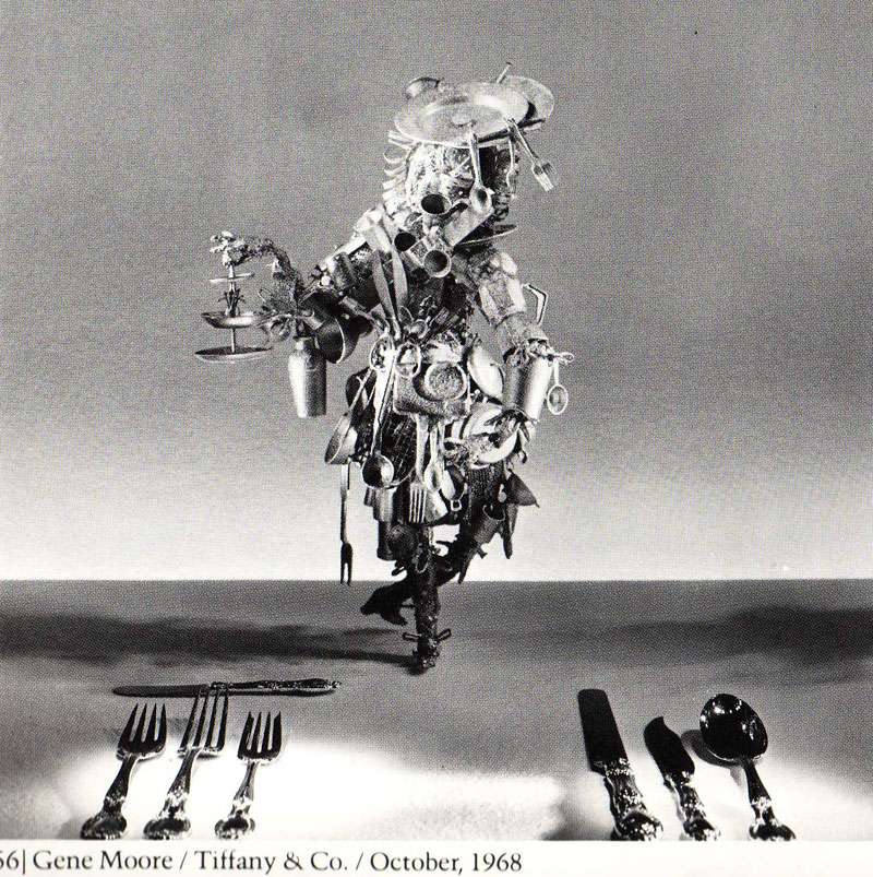
 here : he tied many different objects into his visuals, using old pistols and rusty horse shoes to create a time capsule that one could see into. It almost looks as if your staring at a floor and the objects are laying there and not actually hanging on the wall. His out of this world imaginary paired so well with the "cream of the crop " brand image that Tiffany &Co is already associated with.