Thursday, November 29, 2012

Esther's Blog Post 8

The some of plastic bag rosettes.

The garbage bags full of old news papers.

The bodice of the dress (it kept loading upside down even though I took it right side up)
Since the beginning of this project I have been excited to see how things would come together. As of this week we still have a ways to go before it really starts coming together. Making all the rosettes was a little time consuming, but being able to multitask made it go by quicker. The dress is going to have a few different modifications to it because I had a hard time with the pattern, but think that it will still turn out just like I'm envisioning, a winter wonderland! There have been a few struggles with the project and having everyone there to help, but I think in the end it will all work out to look amazing!
There are still a few things I have to do to having it 100% ready by week 9; finish up the dress, which I plan on finishing before the weekend starts so I can start sewing the rosettes on the skirt, and just making sure that I have enough rosettes to cover the skirt. The last thing I have to do is glitter spray the dress so that it will sparkle, just like the snow when it has been untouched! Less than 2 weeks to go! Good luck everyone!!

Tuesday, November 27, 2012

Kathy Blog Post 7


 For The Club I decided
to go with these powerful
mascuslin Mannequins. It
goes extremely well with The Club's look. They show energy and strentgh which matches perfect
with the exercise store.
http://www.universaldisplay.co.uk/mannequins/


For my second choose I decided to go with Underworld. Picking these two graceful yet sexy mannequins. These mannequins will display the underwears inseductive way. Making the customers want to purchase the underwears more. it gives the customer a feel of what it might look like on them and make them feel invited.

Blog Post 7 Krystol


i chose a wooden mannequin for "Stagebrush" which is a western themed clothing boutique. I think this mannequin is very fun and fits in with the theme of the store and can attract customers in with the clothes standing out on this wooden finished mannequin.


the second mannequin i had picked was a head that is very cool and different to use for "Artisan Alley" for wearable art. I think if the artist creates jewlery or ect this head would be perfect for a more futuristic look and artsy feeling with the theme also.
 
bustshelves image

blog post 7 jorlenny

Artisan alley is a southwestern gallery that specializes in native american jewelry and southwestern jewelry. for this reason i would choose a simple mannequin with not much movement so that the focus will be on the art that is displayed. This would be showing off the beauty of the art instead of focusing on the way it looks on the body or the movement of it.
The next mannequin I chose was for a CEO. The reason I chose this is because it looks strong and masculine like a CEO usually is. A CEO usually has authority and this mannequin looks firm and sturdy the way a CEO keeps his business. It also is a a great way to show off the suit, which is what makes the CEO look professional. Its also clean and sleek and every CEO should have a clean, sleek, simple and sophisticated attire.


Arianna BP7

I choose this Sculpt Vision Mannequin from Bernstein display to represent the ideal mannequins for Underworld Women's underwear because it looks very natural and human-like, is very sexy and eye-catching, so people can easily understand how it looks on their body. 

I also choose this look from Bernstein display for  Stagebrush that is a Western- themed clothing boutique chain operating in Arizona, Colorado, and Montana ski-country resort areas, because it has an attitude that tells something, looks very rude and masculine and I believe it would represent the brand image very well.


Heather Post 7


I chose this first mannequin for Underworld made by Greneker because of the forms sleek yet sexy physique. The mannequin’s elegant facial features are subtle yet natural like the fibers used to create the product they’re intended to sell. I also chose this particular figure because I felt like it would display and sell the merchandise of Underworld very well.

Secondly I chose one of Universal Display and Design’s mannequins for Artisan Alley because of its abstract shape and posture. This particular form is much more art itself then the typical conventional mannequin and therefore I think it would fit in very well with Artisan Alley’s brand image. I personally am a huge fan of this type of mannequin and this one in particular because of the diagonal cut in the bottom of the legs and especially the finial at the neck in replace of a head.

Blog post #7..... Brittany

Artisan Alley:

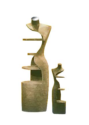
I would pick this one because when featuring your art work the figure does not need a head. Secondly this specific mannequin has a motion so depending on the artwork this could actual make the art look more realistic when wearing it because it shows that you do not have to just stand in one place, but can wear this piece anywhere. The way he hands are delicately placed behind her and out of the way from blocking the artwork was another reason I chose the particular mannequin.


CEO:

I chose this one, because of the fact that this guy looks important. His leg is crossed which shows that even though you are wearing your very nice suit you will be able to render everyday movements such as crossing your legs. Also with his arm laying across his leg show authority which CEOs would want to express. The beside or behind him reminds me of in the movies when they are looking out their big open windows with a view. So this is how I picture this one setup.


 Images from:
 www.bernsteindisplay.com


Monday, November 26, 2012

Mariela Blog Post 7

Universal Display & Design
      
      The two clients I chose to find the best mannequin for their brand image are Stagebrush and CEO. Stagebrush is a western themed clothing boutique chain operating in Arizona, Colorado, and Montana ski-country resort areas and CEO is a conservative menswear apparel store specializing in high-quality suits, shirts, shoes, leather goods, ties and other accessories.

      The best mannequin for Stagebrush brand image would be from Universal Display & Design. The recyclable product torso papier-mache (Left) would be a simple mannequin to display a plaid western shirt or a dress at a boutique displayed window. The simplicity of the mannequin would make the clothing standout. http://www.universaldisplay.co.uk/mannequins/papier-mache/product.aspx?id=pmft2 
http://www.bernsteindisplay.com/


       The mannequin I thought would be best for a CEO, conservative menswear apparel, store would be the one from Bernstein Display. The headless male mannequin can be dressed up from high-quality suits, shirts, shoes, leather goods, ties and other accessories. The ivory color would make the suits standout since they are mostly dark colors. http://www.bernsteindisplay.com/popup.asp?id=619

Maries Post MANNEQUINS

These mannequins can be used for Stagebrush- a Western- themed clothing boutique chain operating in Arizona, Colorado, and Montana ski-country resort areas. I chose this look because its bare and can be idealized to anything especially western. 


These male mannequins can be used for an upscale mens suits shop. I chose this because it looks tailored and it will compliment any menswear. CEO- a consrvaitve menswear apparel store specializing in high-quality suits, shirts, shoes, leather goods, ties and other accessories

Sunday, November 25, 2012

Esther Blog post 7


These 2 mannequins I believe would work really well with the client The Club. The shape of the torso will be able to really show off the type of exercise apparel appropriately that they have in the store. The white of the mannequins are sleek and clean being able to show the details of the athletic wear, as well as the colors.

http://www.universaldisplay.co.uk/mannequin-torsos/body-forms/default.aspx

  
I think that this type of mannequin would make a great statement for the client Artisan Alley. They display wearable art apparel in their shop and I think that this would help to show off the art on a unique mannequin
. It is almost like an art piece itself, but just enough to really show of the garments that they may decide to display on them.

http://www.sevencontinents.com/propaganda/index


Tuesday, November 20, 2012

Arianna p6


This picture was taken from Homegoods, as you can see every section is organize by themes like Country Accents, Traditional & Classic, Global Influences and it can be very easily found with those sings on top.
On each display you can find multiple different things like, table decoration, wall decoration,  jars, boxes, all that kind of things but without losing the theme.
Every display has a 'little bruchure' of what you can find on each section, on front, that is the first thing customer see before entering to the section, there you can see they try to make it very harmonious, and on each section they can use a different color history; for example on this Country Accents display, they use different intensities of green, yellow green, yellow, and creamy colors to have some balance and be eye-catching and eye-understanding.

Blog Post 6 Krystol

this is a wall fixture at west elm that is very simple. It does not have high signage or graphics to catch the customers attention to this wall, every wall display they had was very home like, not too crazy but i guess it matches the theme and brand of the store.
 The theme of the wall display is very simple and home like. The products that are showcased are blankets and little home decorations with cabinets and such. The fixtures they use are regular shelves and have the bookshelf/library set up. and there is a color story on this wall . it goes from white, green,lnavy blue and reds.

Kathy Blog post 6


I went to West Elm and automatically fell in love with this wall ficture. Theres a lot of graphic and it deffinietly draws customers to the wall. Once you walk into its the first thing that catches the cutomers eye. I would say the theme is a wintery christmas forest like theme. The wood gives it that forest feel and the randears, lights, and the color story gives it that christmas feel. Everything is pretty much in the neutrul tone family. The colors give you a calm and relaxed feeling.

blog post 6- Heather

     While shopping at target this morning the most attractive wall display I stumbled upon in the home furnishing department was a spotlight on designer Nate Berkus. The high signage and picture of the designer was very inviting and appealing. Although the department labeled within the department was titled frames there was much more showcased in the display, from vases to lamps to ceramic knick-knacks and coffee table books. This particular display used a long gondola style fixture allowing all of the merchandise to be seen and easily accessible. However other then the two accent lights above the graphic there wasn't any other lighting  being utilized other then the over all general lighting of the store. Also the designer had a very apparent color story, a black and white neutral to a few hints of earth tones.

Blog Post #6 Brittany


There was very minimal signage. It is more like a walk around our store and check it all out.

The wall display i saw was of the decorative plates they offer  and the place mats that may with the plate set you are looking at.


There place mats, dishes,and table displays to show off how your place mat and dishes would look on the table. there were also napkin and napkin rings in the same area.

They have easy access shelving with accent lighting, spotlights, and lcd lighting so you can see the true colors and make you want to buy the items they have set up for you.

At the front of the store they featured their Christmas decor, but my photo they showed the harvest colors, that show you what you could have with your thanksgiving supper.


Devon

From the entrance of the Macy's department on second floor, there was a be display in the center, which it means this area offering the merchandises for bedroom.  The idea of this collection was fro the holiday season.  The bed was about 10 feet away from the entrance, and the walkway on both side of the bed, which make the shoppers feel more like home.   On the right side of the bed, there were few standing display with the bed sheets and the pillows and it lead us right into the bed  collection which fixture from Hotel collection.
Directly opposite of the Hotel collection there is another wall fixture that has Hotel collection on the center top and below it there are the display of the vales, bed covers and bed sheets.  To the left side of the bed, there were the dinning display with many dining set in difference colors display which make the shoppers think of the dining room at home.  The used of the colors for the bed were not many colors, there were just 2 colors that standout as see in the picture that only Dark Red and Gray color.  The colors were used  in this collection brought up a warm and joyful holiday environment.


Sunday, November 18, 2012

Esther Blog Post 6

                                                                 Christmas at Pier 1
There were no real signage around on the walls in Pier 1. Their wall displays went all the way up the wall to the ceiling with merchandise. Their whole theme was almost all in Christmas decor except for a small part that they still had dedicated to Thanksgiving. This display they put everything that could go with having a Christmas part on the table; table runner, placemats, plates, napkins, wine glasses and so much more. They set a few seats to show how you could set everything up. The fixture that they used was a table and chairs that they were actually selling. Which is a good way to showcase products and not have to bring other fixtures and waste space. Red was a HUGE color in the store, but at this setting there is red and green with a splash of gold throughout. The color story is quite obvious here since the colors are red, green, and gold. It helps the customer to feel the happiness that you can feel during the holiday's. The colors are so rich and vibrant and they just make you feel happy!
This was the Thanksgiving table setting and they had pumpkins kind of piled in the the corners and were lite up with lights. On the wall they had mirrors and other wall decor. The colors in on this display were green, orange, and gold.

Thursday, November 15, 2012

Pier 1 Display

This was my favorite display in one of my favorite stores. Looking at this made me feel like i wanted to be country side drinking a refreshing iced tea or lemonade. This display had no signs pointing in it's direction but it did have a sign of the items and prices. The theme of this display is modern country with a classical taste. Different products showcased on the wall display are pillows, cool and unique candle holders, candles, clocks, wind chimers all decorated with a 2 piece country couch. Some of the fixtures that are featured includes an intricate hand-carved wood divider which compliments the couches and pillows. The color story is very apparent. The colors of cherry wood, dark red, gold, creme, brown and green goes well with this display.

Tuesday, November 13, 2012

Jorlenny Blog Post 5


  For my groups display we are not using many iems. We're mainy using plastic bags. I've already collected a few. With these bags we'll be making rosettes. Here's an example of how they will look. We are also collecting lots of scraps of papers. I've also collected many pages of papers and magazine pages.

Monday, November 12, 2012

Mariela - Blog Post 5

Over the past week I've collected materials for my reusable resource, "Walking In A winter Wonderland," visual display. The materials I collected are soda cans, walmart plastic bags and soda tabs. I plan to incorporate these materials into my display by using the plastic bags to make flowers. The flowers would then be sewn on the dress. The soda can tabs would be used to make flowers also and after making the flowers out of soda cans they would all be attached together and added to the bottom of the dress. I would also use the soda can, bottoms, to add detail.

Blog Post 5... Brittany


The dress that was imagained by Krystol was one made of mops. The piece i put towards this project so far is i bought a couple mop heads from target, and I also asked T.J.Maxx  to make a mop head donation. I have not gotten anything from them yet but I am still trying to work on getting some mop heads from them to use for this project.

The second part is that I bought a can of black spray paint to apply to the mop strings. The dress was imagined as black and so I thought this would work, but Krystol texted me after she tried out a mop head with black dye and spray paint and the color was not turning black but a dark purple. So I have since then returned the spray paint and have been thinking of other ways to bring her vision to life.

Kathy Blog Post 5

 
My group and I are heading to achieve a mop dress. I haven't collected much but this is a mop I broke apart so we can use it for the bodice of the dress. We plan on sewing strip by sript for the top. Im pretty excited to see how everything turns out. This week coming up I will go around to department stores to see if they can donate mops for the project.

Krystol Blog Post 5

 
Mop Gown
 
I have been calling and collecting mop heads over the past week and had a couple of donations from friends and 12 mop heads donated from Lewis Janitorial, the owner was so sweet ! My group and I should have enough for atleast the front of the gown because I have different sizes of the strings. I also have been trying to color these strings first with spray paint, wasted 2 cans with 2 handfuls full of mop strings so i tried dying them black........... ANNNDDD they turned different shades of purple, which wouldnt be a bad idea to leave them different colors for a more raggedy look, but we shall see ! im having lots of fun with this project !

Sunday, November 11, 2012

Marie's Blog Post: Reusable Materials


Recycling Fashion!!


For this dress, we plan on using cans and plastic bags.
The cans will be used as details or trimming on the dress. Like beads or crystals.

The bags will be used for the body of the dress.


Friday, November 9, 2012

Esther Blog Post 5


These are a few of the material's that we will be using to make our visual display. The dress is going to be made out of plastic bags. We are going to rip the white bags into different size pieces to make rosettes and have part of the train of the gown look flowing like hills of glistening snow. The news paper is going to be used under the dress to give it a bit of flare in the skirt and also to form the flowing hills flowing into the train of the dress. I'm so excited to see how it all comes together!

Tuesday, November 6, 2012

Ashley-- Blog Post #4


This is a picture of my friend Ashley and I, this was taken yesterday. We were dressed up and going out for her birthday dinner. We both decided to wear wedges, to make a little dressier than usual. I chose to wear a simple cotton dress under a black blazer. She chose to wear a cotton tan under a denim shirt with skinny jeans. I definitely decided to wear the blazer because it was a little chilly last night. Ashley chose to wear jeans for the same reason. Both of us stayed neutral with our color selections, but I did think it was funny that we both chose to incorporate stripes in our outfit choices. But it was nice to finally get out of the house, and to be in something other than sweatpants and tshirts for the last week and a half due to being sick.

Krystol Blog Post 4


i decided to dress myself, and put together a very casual outfit. Cheetah Print is one of my obsessions and its something that is never out of style and brings such a pop to your outfit. I am wearing a plum peplum blouse from NY & Co. that is really stretchy and comfortable adding a cheetah print belt also from NY & Co. For the pants I am wearing jeggings with an elastic band without the zipper and button which is so much more comfortable !! Now for accessories im wearing gold to match the cheetah print, so gold earrings, necklace and my watch is black, gold with cheetah print and for the shoes im wearing steve madden flats with a gold studded belt on the back of the shoe .
one perfect outfit for me ! :)

Mariela Blog Post 4

I choose this style because it was the perfect outfit for a night out with the friends. Fall was my inspiration, since it is fall; moreover, The colors have a fall feel. The dress has different tones of brown colors, It also has black, blue and orange. The wedges are black with brown; therefore making the whole outfit match. The night wasn't chilly that's why I decided to wear a strapless dress and wedges. The dress is made out of 100% polyester making it comfortable to wear the whole night.