Wednesday, March 26, 2014
Blog 6 Janira Rodriguez
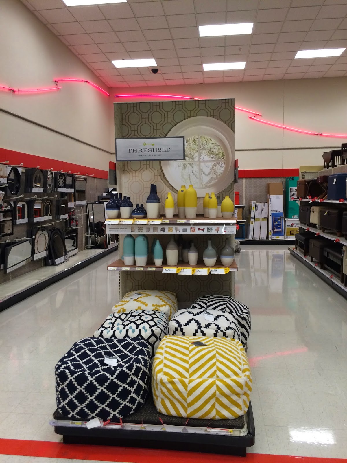
During a visit in Target I found that the fixture in the store it is not attractive to the customers they don't have any signature or graphics guiding the customer to their multi use furniture department. As you can see in the second picture they don't have any guiding sing. The theme on the wall was a red neon light which do not catch my attention at all. Walking to furniture section you can see different types of accent chair and tables. At the entrence on the isle customers can found decorative vases. The fixtures are featured in shelves but the product do not give the customers any visual interest. Target shows pastel coordinating color story in their furniture representing the colors of the season.
Subscribe to:
Post Comments (Atom)


No comments:
Post a Comment